
With it being the new year, a lot of people are making new year's resolutions, which they plan to withhold (or not withhold) for the following year. I'm guilty myself of not eating better or exercising more (as I'm sure many of us are).
However, this year I have made it my resolution to read more books, something that I can get behind. My Kindle armed to the nines with books for the next few months; I felt it fitting to have a showcase of book designs and redesigns from books all around the world.
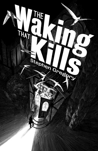
'The Waking That Kills' by Stephen Gregory
Cover by Nico Delort
'Journey to the Centre of the Earth' by Jules Vernes (Portuguese Edition)
Cover by Carlo Giovani
The multiple layers gradually draw towards the centre of the cover where the title of the book is, the type with swashes that is framed beautifully by the cascading layers and shadows.

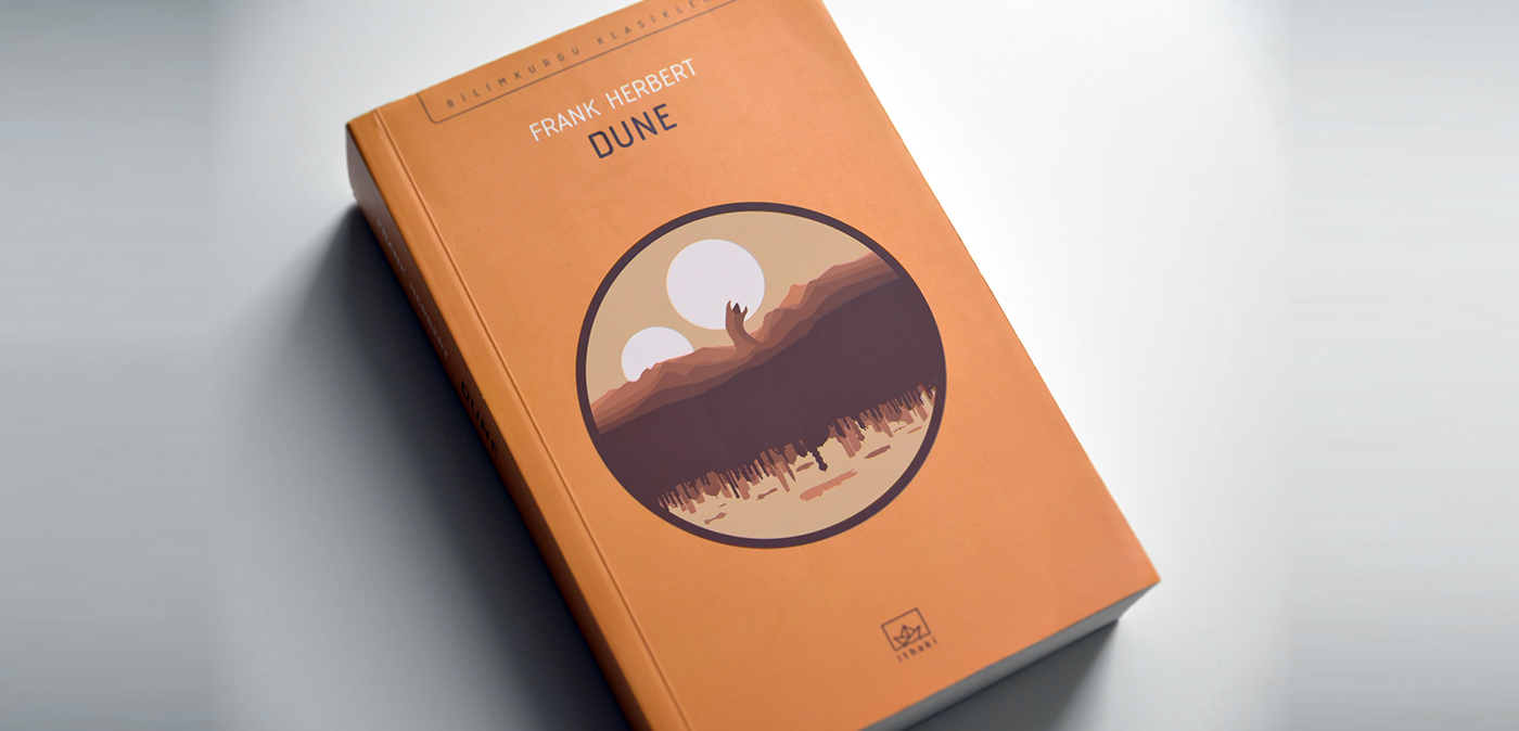
'Dune' by Frank Herbert
Cover by Ozan Korkut
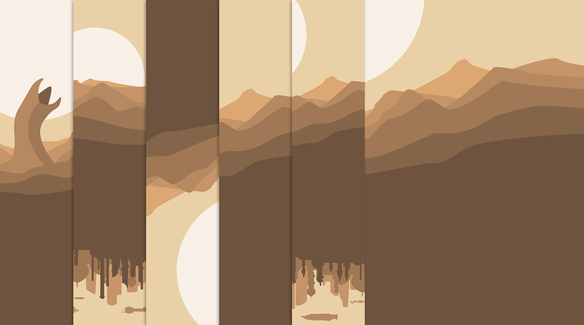
A multi-layering effect is created on this cover by using a simple colour palette of browns and varying shades of this. I have always liked this style of illustration and think it represents the worlds inhabited by the human race in the future.
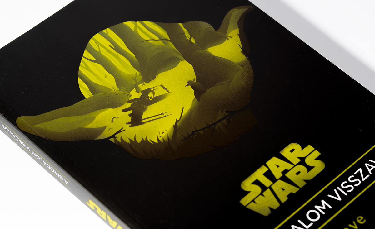
Star Wars Trilogy (as books)
Design by Adam Faniszlo
The multilayering effect once again features on these lovely adaptations of the films. With the parts of the landscapes forming iconic characters from the trilogy; Stormtrooper, Yoda and Darth Vader.



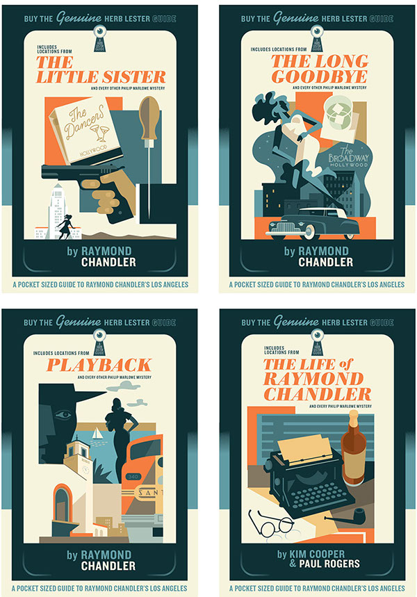
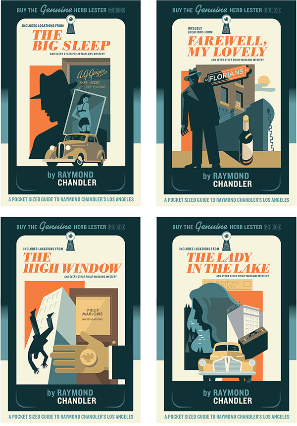
'The Raymond Chandler Map of Los Angeles' by Herb Lester Associates
(and accompanying promotional cover designs)
Designs by Paul Rogers
This isn't exactly a cover for a book per se, but for a guide instead; but I think we can all agree that they look wonderful, all could easily pass as book covers.

'The Man in the High Castle' by Philip K. Dick
Cover by Shotopop
A lovely illustration for the novel depicting an alternative history where the Nazis win World War II and the Japanese defeated the US Navy Fleet in Pearl Harbour and is now divided by the two competing superpowers. This novel has recently been adapted into a television series. The cover is blocked with a nice use of foil on the front and spine. There are many wonderful illustrations also inside the book, well worth a look at.

'Peter & the Wolf' by Sergei Prokofiev
Cover by Phoebe Morris
A very clever illustration where the shape of the tale forms the silhouette of Peter's head. The text in the space created by the silhouette is balanced nicely and sits well on top the snow texture and twigs surrounding it.

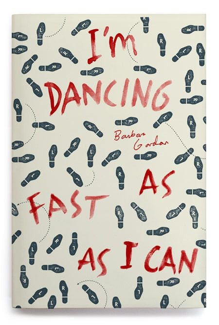
'I'm Dancing As Fast As I Can' by Barbara Gordon
Cover by Oliver Munday
The use of printed dance steps along with the hand-scrawled text is a nice touch.
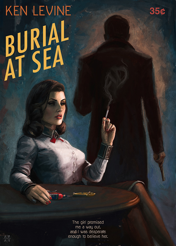
Bioshock Infinite: Burial at Sea (as a book)
Cover by Ástor Alexander
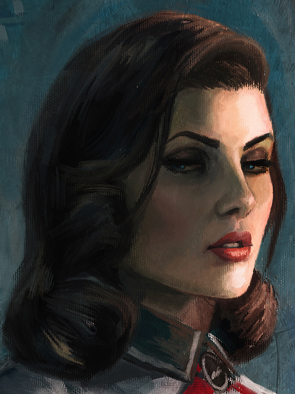
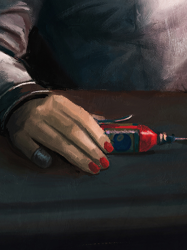
The hand painted look fits the looks and feel of the game and time in which it was set perfectly. You can see from the close-ups how well the artist has gone to paint the smaller details, such as Elizabeth's missing finger (thimble included) and smoke flourishing upward from the cigarette. The silhouette in the background holding the gun makes the cover look a lot more sinister and mysterious.
'The Psychopath Test' by Jon Ronson
The cover has a split personality, a lot like Dr Jekyll and Mr Hyde. One side is calm and very precise. The other, brash and exciting, with the use of bright colours, misaligned and distressed text, all brought together with an image of an enraged leopard.

'A másik szárnysegéd' by Vilmos Kondor
Cover by Adam Faniszlo
The cover reflects the noir genre in which I believe the novel is set in (as I can't read Hungarian) due to the imagery used. The orange background helps draw the eye into the image inside the silhouette wonderfully with shadowy old style car creating mystery well.

The saying does go 'DON'T judge a book by its cover', however, I find myself not being able to resist with covers like these. Hopefully, the books hold up and it paid off to judge them only by their covers.
Do you judge books by their covers?
 By
By