 On November 9th, HubSpot announced that a part of the former Leadin product, Lead flows would now be available for HubSpot Marketing! Lead flows allow you to create pop-up forms, yes pop-up forms. You might be thinking, are these really inbound? And, why, they're so annoying!
But hold up, as HubSpot has said, 'it really depends on the intention and execution - non-interruptive pop-ups can be inbound, and data proves that they work'.
In fact, 'Aweber found that using a pop-up form for obtaining subscribers converted 1375% better than a traditional form'. In addition, the top performing 10% of pop-up forms convert at a huge 9.3%! So why wouldn't you want to use pop-up forms across your website? Exactly, you do want to.
And not all pop-ups are bad, they can be used for good! They can be used to add value to the experience of a user, and therefore can make a healthy part of your inbound marketing strategy! So, how can you use lead flows in HubSpot, read on to find out...
Select the flow type
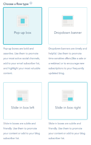
When you create a lead flow, the first thing that you have to do is determine what kind you want to create. Depending on the page that you're adding the flow to, consider the user experience and think about where it would be best for the user to notice your pop-up and where it will support the overall goal of the page. Here are your options:
Pop-up box
These are the most attention grabbing, and are best used for the promotion of your social channels, to grow your email subscriber list or to show the most valuable pieces of content that you have.
Dropdown banner
The dropdown banner is best used to promote an offer that is timely like a sale, or a webinar, or again to grow your subscriber list.
Slide-in box
These are best used to promote your downloadable content offers.
Whichever you choose, make sure that you consider the layout of the page and keep in mind your goal at all times.
Get creative
As a HubSpot customer, you'll be pretty used to creating the perfect CTA, and these should be no different.The whole point of your pop-ups is to make your website visitors do something, so don't skimp on the design of your CTA. This is your opportunity to grab the attention of your visitor with a brief description of what you're offering using an engaging title, captivating copy, a striking image and a colour that will stand out.
Colours are pre-selected by HubSpot when you're creating your pop-up, due to proven conversion rates in relation to colours, but you do have the option to change these so that they're more on brand.
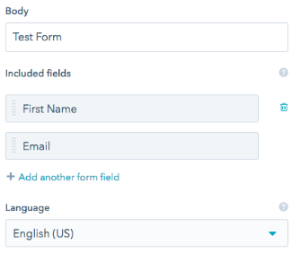
Add form questions

These need to be as short as possible, you don't want to put people off filling them in! Please keep in mind that lead flows shouldn't replace your traditional HubSpot forms, but they are great for micro-conversion points like blog subscriptions! Any form fields that are added here, and any data collected will sync back to your HubSpot contact properties and then be available for you to use in list segmentation.
Once you've added your form questions, you can also create a thank you message that your visitor will see once they have filled in your details.You could also include a link to any additional resources that you feel would be relevant here.
Choose when and where
In the options step, you can choose when and where your lead flows will display, as well as the internal name for your lead flow and any internal email notifications you want to setup.
When choosing where you'd like your lead flow to appear, you can choose the exact match URL option (where you can just enter the URL of the page) or you can use the wild card option, for example "http://www.website.com/blog/*" - the asterisk on the end of the URL will mean that it appears on all pages on the blog.
User interaction
It wouldn't be inbound marketing if we didn't consider the user experience of a web page, and how pop-ups can affect this. So, there are user interaction options. These include:
- Page scroll - which will trigger the lead flow the moment a visitor scrolls down 50% of the page
- Elapsed time - which simply triggers the moment that a certain amount of seconds have past
- Exit intent - this triggers when the visitor's mouse exits the browser window, when they're about to close the tab
Lead flows are also fully optimised for mobile, and we would recommend that you consider the experience of pop-ups for mobile users... there is the choice for you to disable it should you wish.
GO!
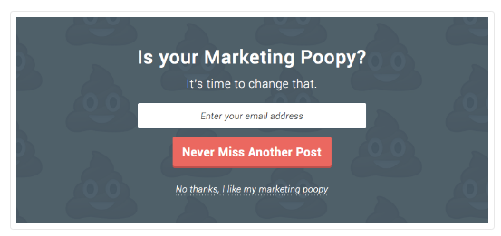
Once you've gone through all of these stages you can preview your lead flow and publish it! Here's an example from HubSpot of a great pop-up box:

Remember, keep an eye on the performance of your pop-ups and make tweaks to increase conversions when relevant.
There is also the option for you to connect lead flows to an email provider. If you're a HubSpot Marketing Free or Starter customer, you can integrate the tool with Mailchimp which will allow you you create an autoresponder to send an email to any new conatct added to a Mailchimp list through a lead flow or other form.
If you're a HubSpot Marketing Professional or Enterprise customer, you can create a workflow to automatically enroll contacts based on form submissions, and then send your contacts an automated email from HubSpot.
 By
By 