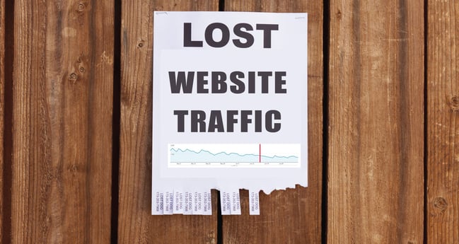
Almost every business now knows that their website is their most important asset when it comes to getting found by new prospects, sealing new deals and keeping returning customers happy and well informed.
But, even with all of the information and best practice available across the internet, when designing our own organisations' websites, many of us completely forget about any bad user experiences we have ever had.
When looking at adding new elements to our websites, it's important to place yourself in the shoes of your visitor. To help you with this, we've compiled 5 of the most damaging website elements sure to drive your website's bounce rates through the roof...
1) Not responsive to mobile devices

Pinch, zoom, scroll, repeat. There certainly isn't anything much more frustrating than visiting a website on your mobile device and it not being mobile optimised.
With so many websites offering similar information, you need to ensure that your visitor doesn't have to work to navigate your website and view your content.
Not only do non-responsive websites provide poor user experience, they will also be affecting your website's SEO. Since an algorithm update in 2015, Google now pushes mobile-friendly websites further up the rankings, making it even more important to create a responsive website.
2) Pop-ups

From a marketer's point of view, pop up calls-to-action are a fantastic idea... there's no chance of your visitor missing your content and you're sure to increase conversion rates by making it almost impossible to escape, right?
Wrong.
Pop ups are one of the biggest, and still most popular, form of interuption marketing - something that, as inbound marketers, we will always avoid.
But, if you do want to trial using pop ups, there are a few things you can do to improve the UX:
- Ensure your content is friendly and helpful, and there's an easy way out of the pop-up
- Make them appear after a certain amount of time on the website or scrolls down a page.
- Make the CTA content dynamic to what the visitor is looking at or has previously shown an interest in
- Keep an eye on how they're performing - and get rid of them if they're having a negative impact on your website.
- Trial the use of slide-in CTAs, they're less invasive but still as eye catching as other pop-ups.
3) Cheesy stock images

Sometimes, we simply do not have the time or budget for fancy photographers and in-house photoshoots to use on our websites. But this does not mean we have to resort to the dreaded cheesy stock image.
Fortunately, this was a PR stunt by Vince Vaughn and the cast of Unfinished Business, but pictures of people dressed up in business wear, tearing their hair out or staring into the distance are not going to resonate with your visitors.
The choice of imagery across your website should reflect your brand values, and the product or service you're looking to sell.
It may seem like a trivial element of your website rebrand, but do remember to put time aside to either find non-cheesy stock images, or to create your own visuals. Your visitors will thank you.
4) Takes too long to load
As technology has evolved over the past 10 years, we've become more and more impatient when it comes to browsing the internet.
In fact, if your website takes more than three seconds to completely load, 40% of your visitors will give up and go elsewhere.
The time your site pages take to load are impacted by many different factors, including the amount of media you have on each page, the size of images included and your website's coding.
To test and improve your website's speed, try Google's PageSpeed Insights tool.
5) Complicated navigation

When a visitor lands on your website, it should be clear to them what their next steps should be. No visitor wants to scramble around a website hoping they will land on the right page.
Your homepage needs to clearly indicate what you do, and how your product or service can fulfill the needs of your visitor. Clearly worded calls-to-action and strong headers should be in place to guide your visitor along their desired path.
When it comes to ensuring your navigation is clear, this handy blog will help you determine which order your pages should be displayed to improve your website's user experience.
 By
By